CMA CREATIVE
A self-directed project intended to demonstrate application of robust design process from ideation to final execution of a comprehensive visual communication system.
Fascinated by psychology, I developed the idea for this project based on my own experience with type testing. I learned my Myers Briggs Type Indicator,® (MBTI®) letters (INTP) through corporate HR testing, but I didn’t recall learning how my type could be used to foster better communication with other types. Like many employees, I put the presentation in a drawer and forgot about it. This began my ideation for a more practical user-friendly tool that employees could be given at the end of their training, to reinforce their communication skills.
I believe the solution to any design problem derives directly from solid research of the content, the client and the market. My research uncovered that Jungian Psychology is based on the four different ways, or dichotomies, that a person perceives and judges the world around them.
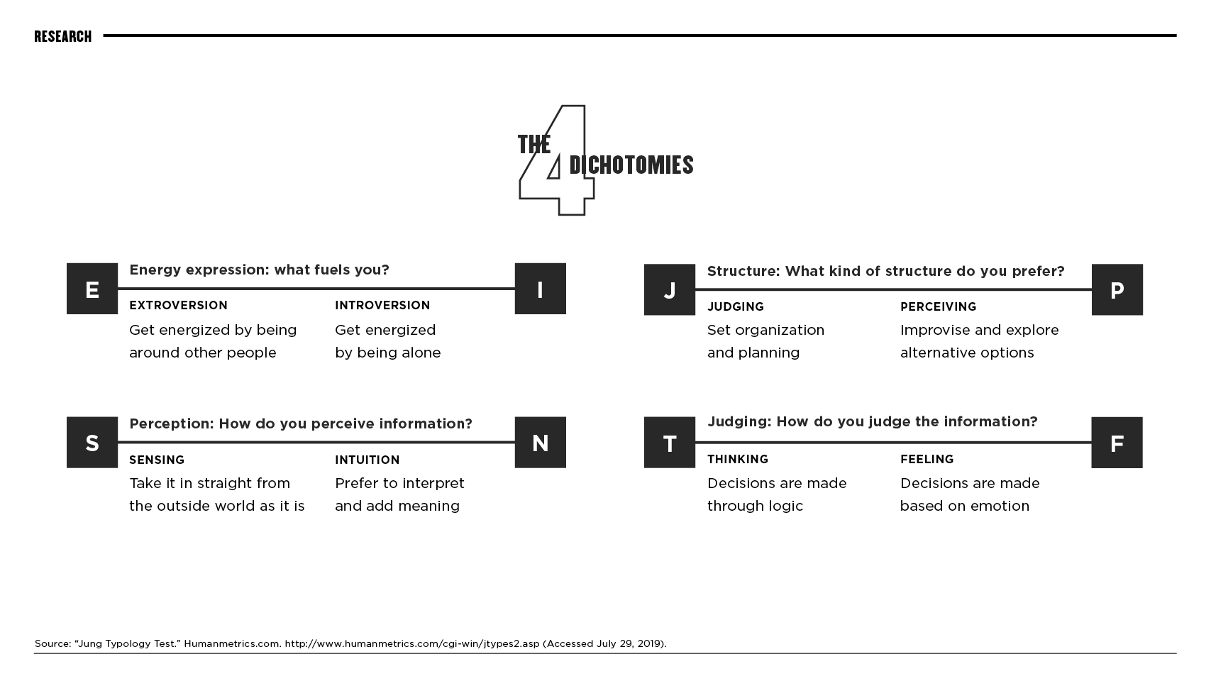
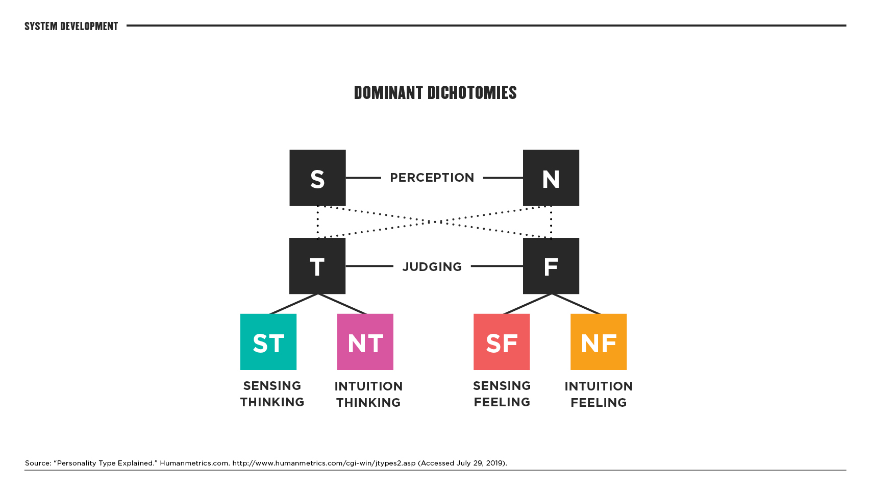
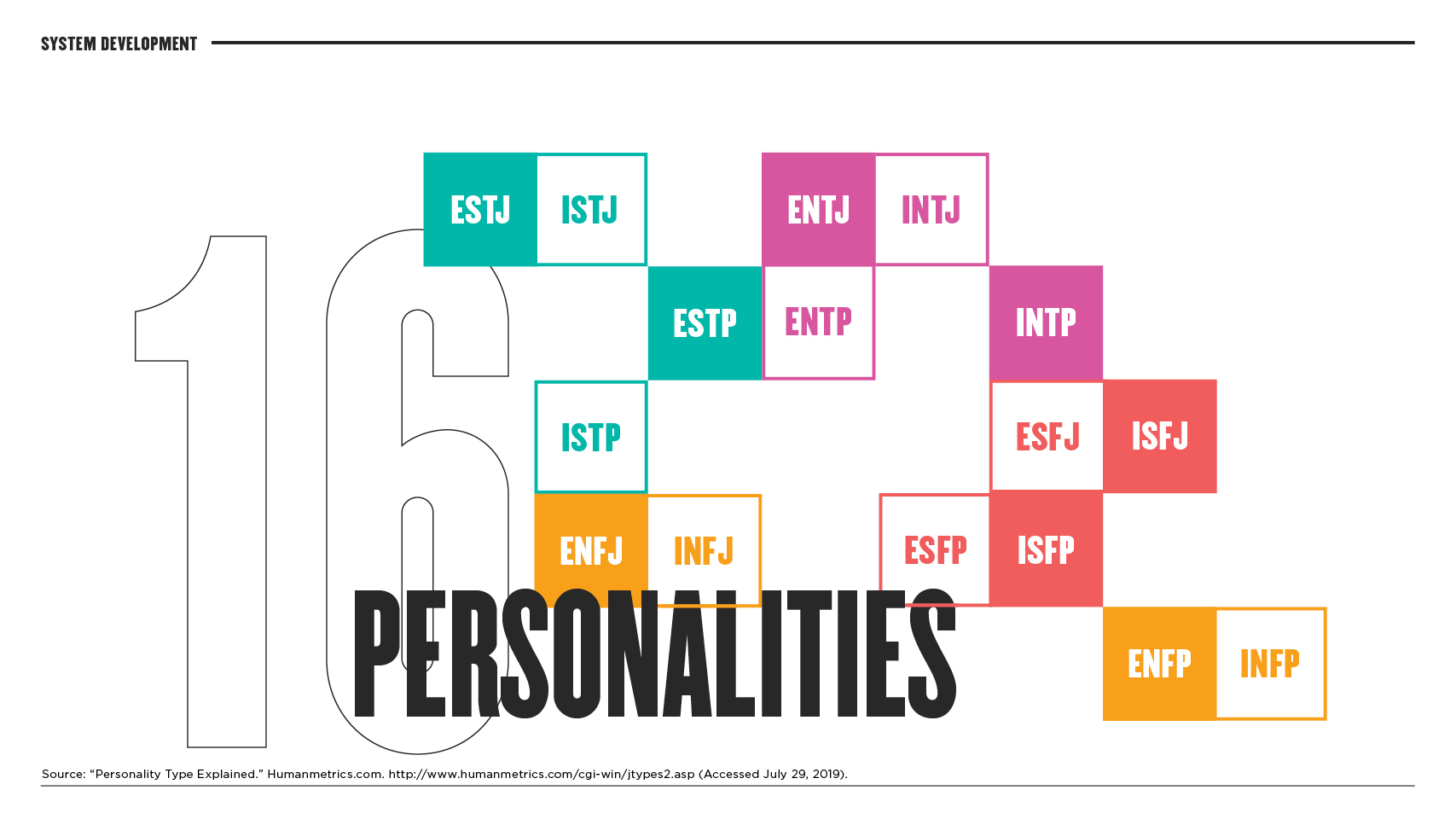
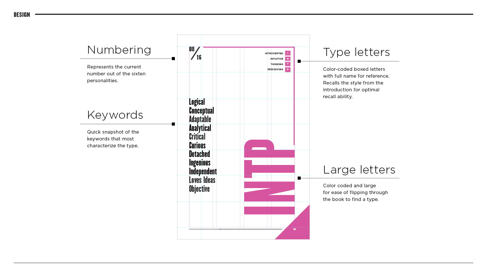
Jung theorized that out of the four dichotomies, two are the most dominant; Perception (Sensing and Intuition) and Judging (Thinking and Feeling). Those give rise to four dominant types, that govern the sixteen individual types. Based on these, I devised a color-coded system for easier recall and comparison.
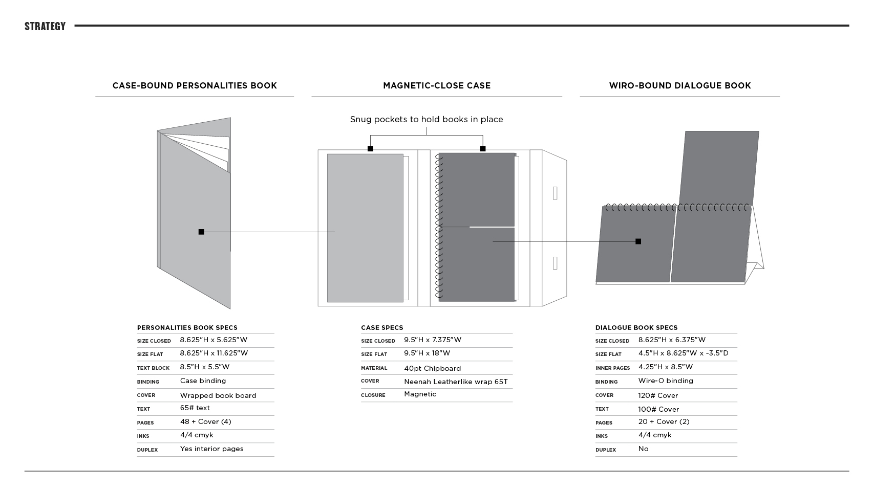
Since the target audience for this piece is working professionals, the environment where it would best be utilized is the desktop. I envisioned the end-product as two books, one outlining the psychology and sixteen personality types and the other as a desktop flip book. The flip book is divided in half and used to show a side-by-side comparison of a type’s communication style versus how another type would best receive the message.
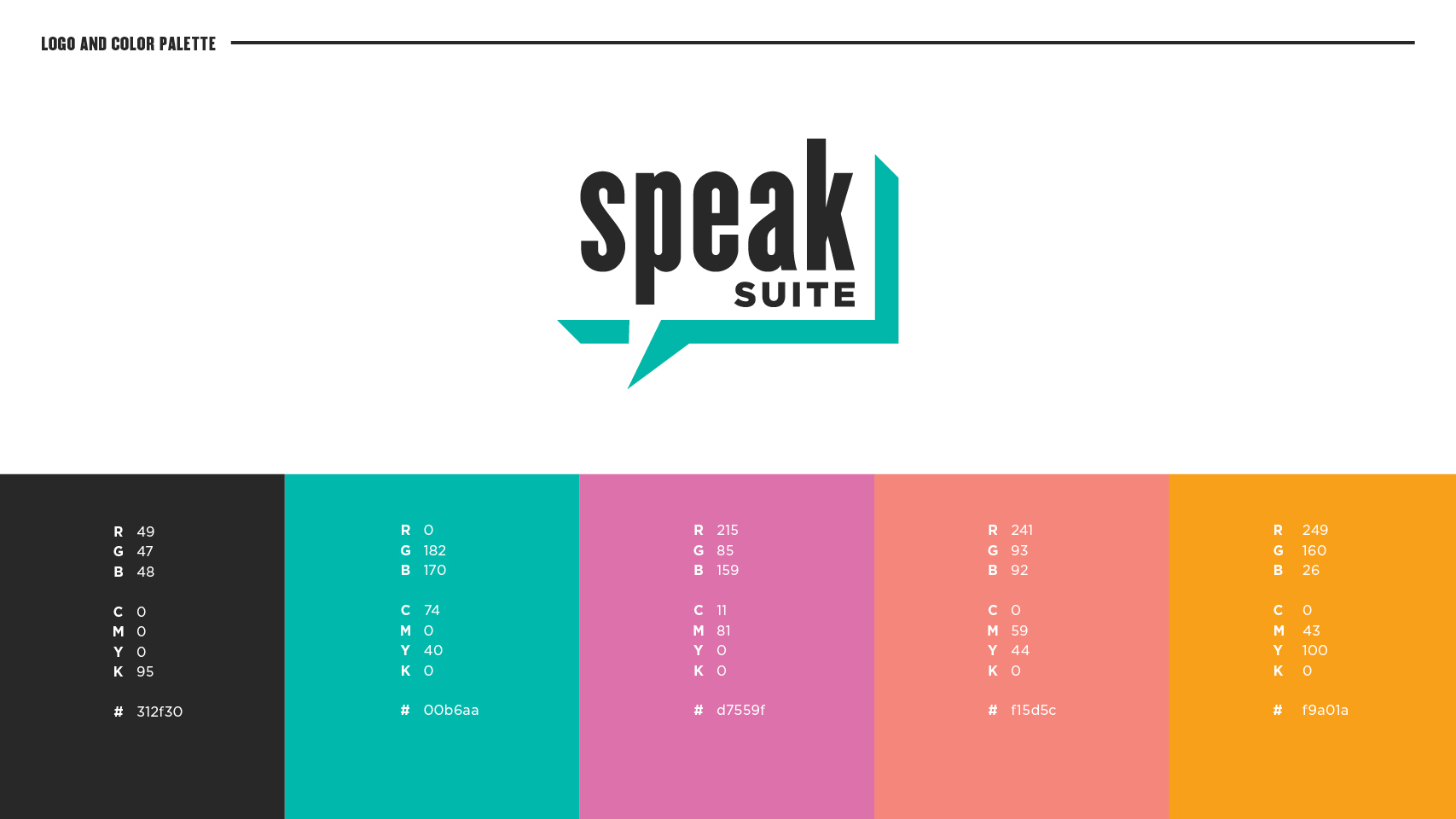
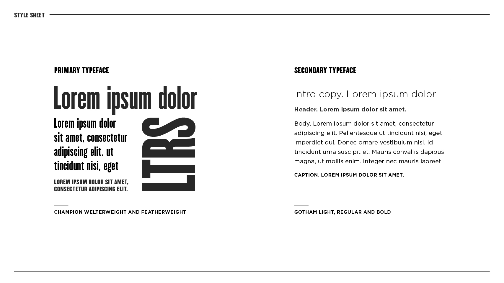
I chose the name Speak Suite for its memorable alliterative qualities and the focus on communication. The logo plays off the iconography of a speech bubble, with lower-case type that is approachable. Informed by the underlying grid of the content, the design called for a strong visual grid with clear, legible and prominent typography. The personality pages organize the content to make it easy for the user to navigate through the book. The covers of both books, with their die-cuts are a metaphor for self-improvement and introspection.
The structured grid can best be seen in the personality pages that organize the content to make it easy for the user to navigate through the book. The covers of both books, with their die-cuts are a metaphor for self-improvement and introspection.
The final books and case are pieces that I am very proud of as it is 100% printed, hand-stitched, glued and bound in my studio.


